Feature Visualization
Viewing the activity levels of a gene or protein is important for determining the cell type and function. In this panel we provide three different visualization techniques that can be applied to any feature.
-
Plot Expression
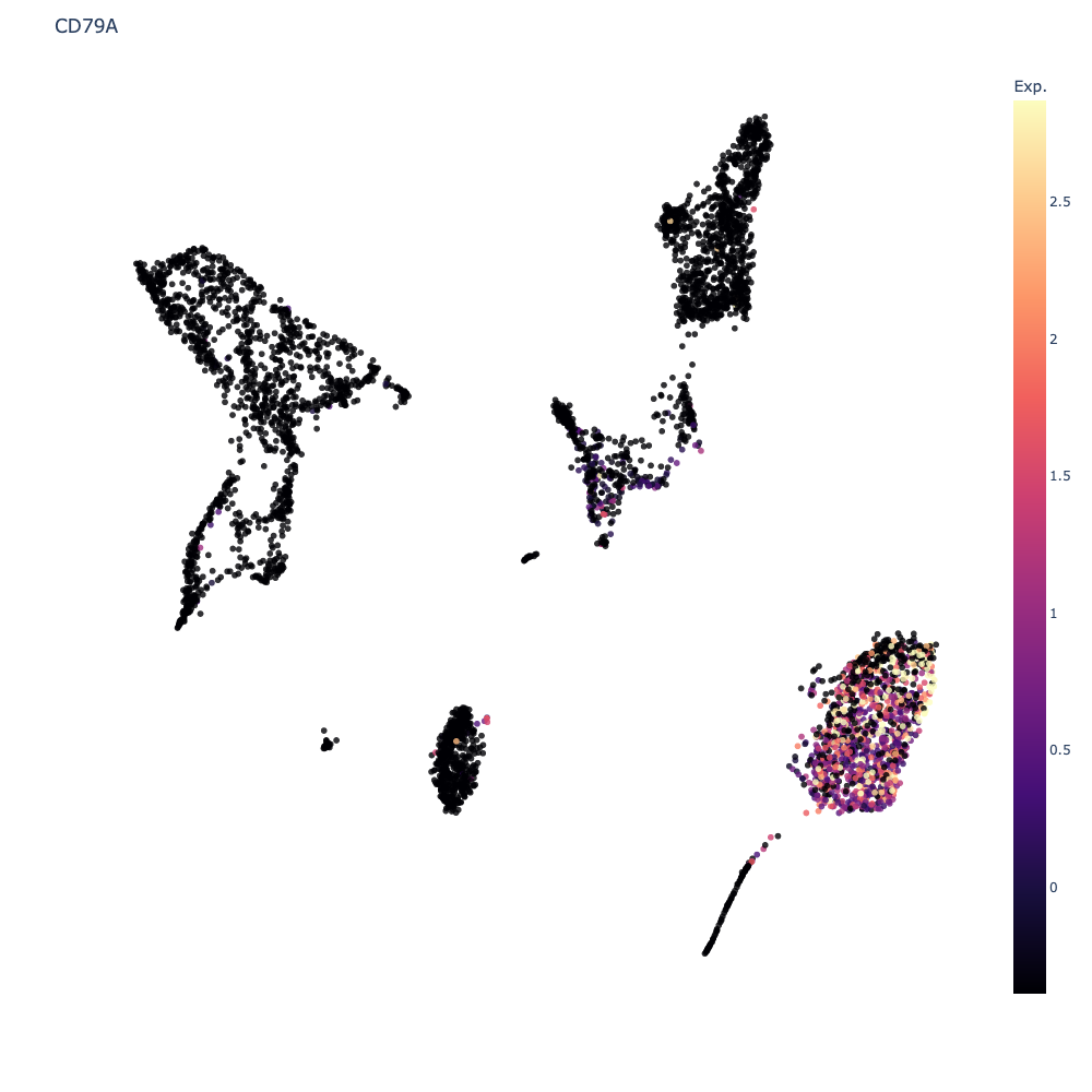
This will update the scatter plot colors to show the expression levels of the selected feature for every cell. To go back to cluster view, click the
Clearbutton. Ifauto-scaleis checked, Cellar will attempt to remove (more precisely, clip) any outlier values it finds so that very high or low values do not extend the colorscale unnecessarily. Uncheckingauto-scalewill enable a range slider for the selected feature which allows manual clipping of the gene range.When multiple genes are selected, a co-expression value is shown. To compute this co-expression value, we first scale each gene to the \([0, 1]\) range, and for every cell we take the minimum scaled expression value across all selected genes. Formally, if we let the expression matrix be \(M\in\mathbb{R}^{m\small\times n}\), then given a cell \(i\in[m]\), and a gene set \(G=\{g_1, \dots, g_r\}\) we compute the co-expression value of \(i\) w.r.t. \(G\) as \(c_i = \min_{j=1,\dots,r} \Big\{ \frac{M_{i, g_j} - v_{g_j}}{V_{g_j} - v_{g_j}} \Big\}\) where \(v_t = \min_j M_{j, t}\) and \(V_t = \max_j M_{j, t}\), i.e., the minimum and maximum expression values for gene \(t\). Notice that \(0\leq c_i\leq 1\). We apply this normalization to prevent biasing the co-expression towards any one gene. We choose to display the minimum as the minimum satisfies the property that \(\min\{0, p\}=\min\{p, 0\}=\min\{0, 0\}=0\) for \(p\geq 0\). In all these three cases we would want the co-expression to be \(0\).

-
Heatmap
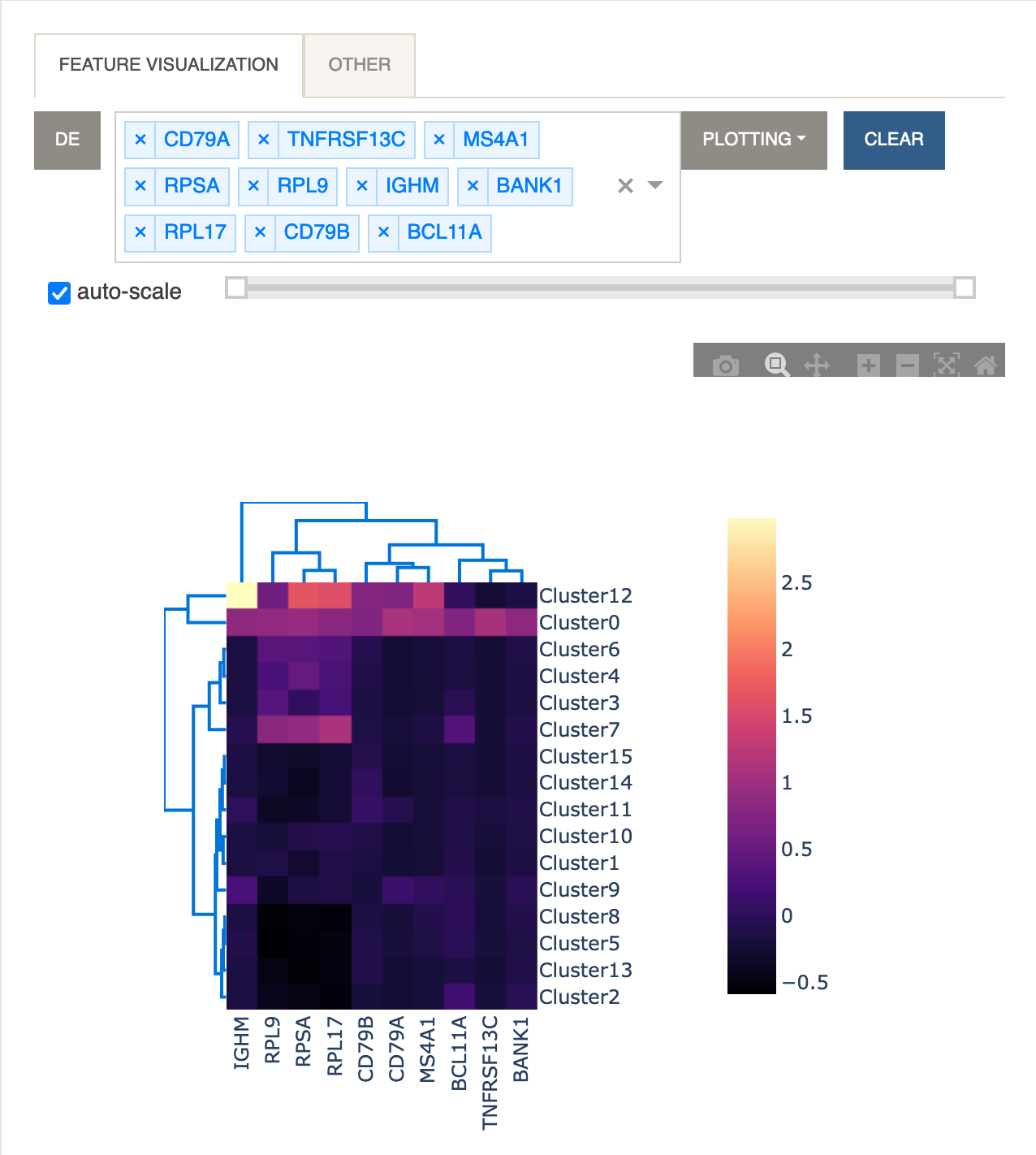
A heatmap is useful for visualizing the average expression levels of multiple genes across different clusters. Clicking the
DEbutton will paste the visible page from the DE table into the dropdown menu so that multiple genes can be easily selected. Rows (clusters) and columns (genes) are linked using hierarchical clustering as implemented in the Clustergram function of dash-bio.
-
Violin Plot
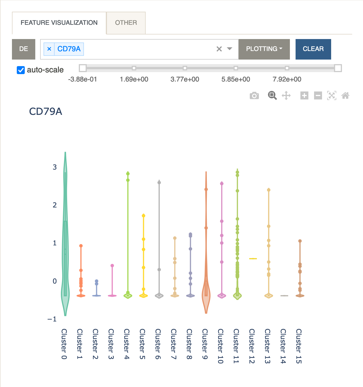
A violin plot is useful for visualizing the expression levels while also displaying the kernel density for every cluster. The same formula described under Plot Expression applies when multiple features are selected.

-
Other
The same visualization tools can be applied to a different modality that has been included in the anndata file. For example, when working with CITE-seq data, it is possible to visualize protein expression data stored in
adata.obsm['proteins']by using this panel. Similarly, one can visualize gene expression data stored inadata.obsm['genes']. The names for these features will be read fromadata.uns['proteins']andadata.uns['genes'], respectively.