Tutorial - Basic Analysis Pipeline
This is a step by step demonstration of Cellar’s basic functionalities. A related video tutorial can be accessed here.
We will use a lymph node dataset generated by HuBMAP. This dataset can be found on Cellar under the name HBMP1_lymph_node_1_counts.
-
Expand the data panel by clicking
Load Dataand select HBMP1_lymph_node_1_counts from the dropdown menu. HitLoad. The dataset has now been loaded into memory.
We can see at the top left corner that this dataset contains 14,348 cells and 16,075 features (genes). Next, we apply some basic filtering to remove cells with too few expressed genes, but also remove low count genes since these are typically non-informative. We also total count normalize the expression matrix and log-transform it. Finally each gene is scaled to unit variance.
-
Expand the preprocessing panel by clicking
Preprocessing. Make sureFilter Cells by GenesandFilter Genes by Cellsare ticked. We set the min and max values for each to 100 and 3000, respectively. TickHighly Variable Genes. This will identify highly variable genes and filter the rest. UnderMisc, tickNormalize Total.Log1pandScale. Leave their settings at defaults. ClickRun.
A notification saying “Finished preprocessing” should appear. We can now see that the shape of the data has changed. The number of cells remained the same, but we now only have 439 highly variable genes to work with.
Next, we reduce the data. To understand what method to use and when, please refer to Dimensionality Reduction. Applying PCA, followed by UMAP for 2D embeddings has proven to be a good combination when analyzing scRNA-seq data.
-
Close the preprocessing and data panels if they are open. Under the dimensionality reduction panel, select PCA and UMAP and click
Run.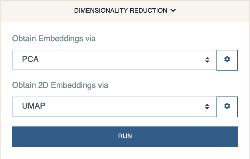
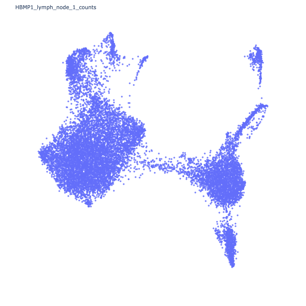
Once Cellar finishes processing, you should see a 2D representation of your data in the form of a scatter plot.
Next, we cluster the data. We will use Leiden clustering.
-
Under the clustering panel, select Leiden and click
Run.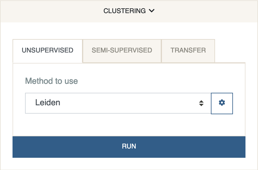
This will color each cell by the cluster it has been assigned to.
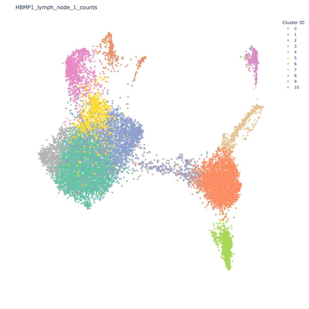
Let us identify some differentially expressed genes for Cluster 0 (emerald green).
-
Under the DE analysis panel, select
Cluster 0under the first dropdown menu and leave the second menu torest. ClickFind DE Genes.
Shortly after, you should see a table of DE genes, sorted by log2fc.
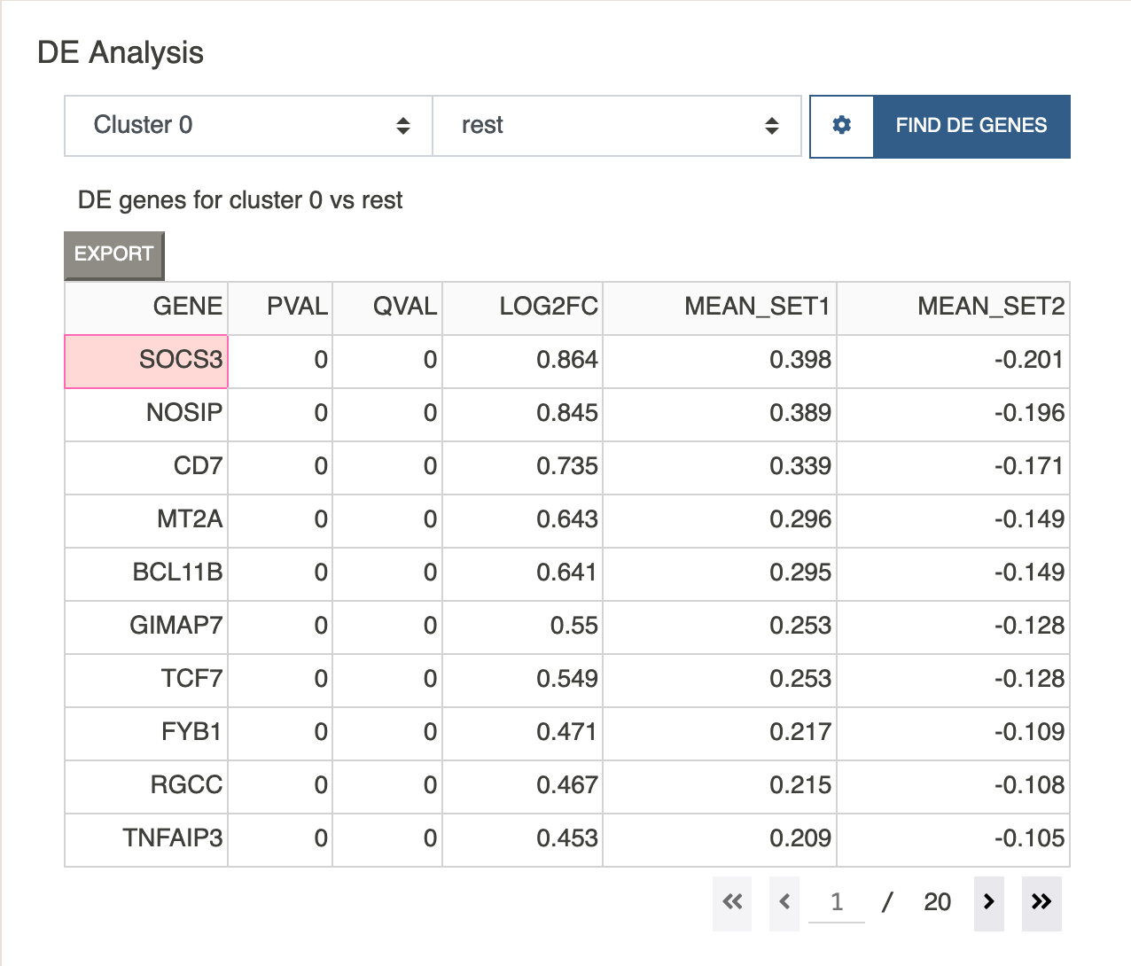
Clicking on any gene will paste that gene to the feature visualization input box. Let us view the expression value of the top gene in the list SOCS3.
-
Click on the
SOCS3gene. You should see that gene show up under feature visualization. Next clickPlottingand selectPlot Expression.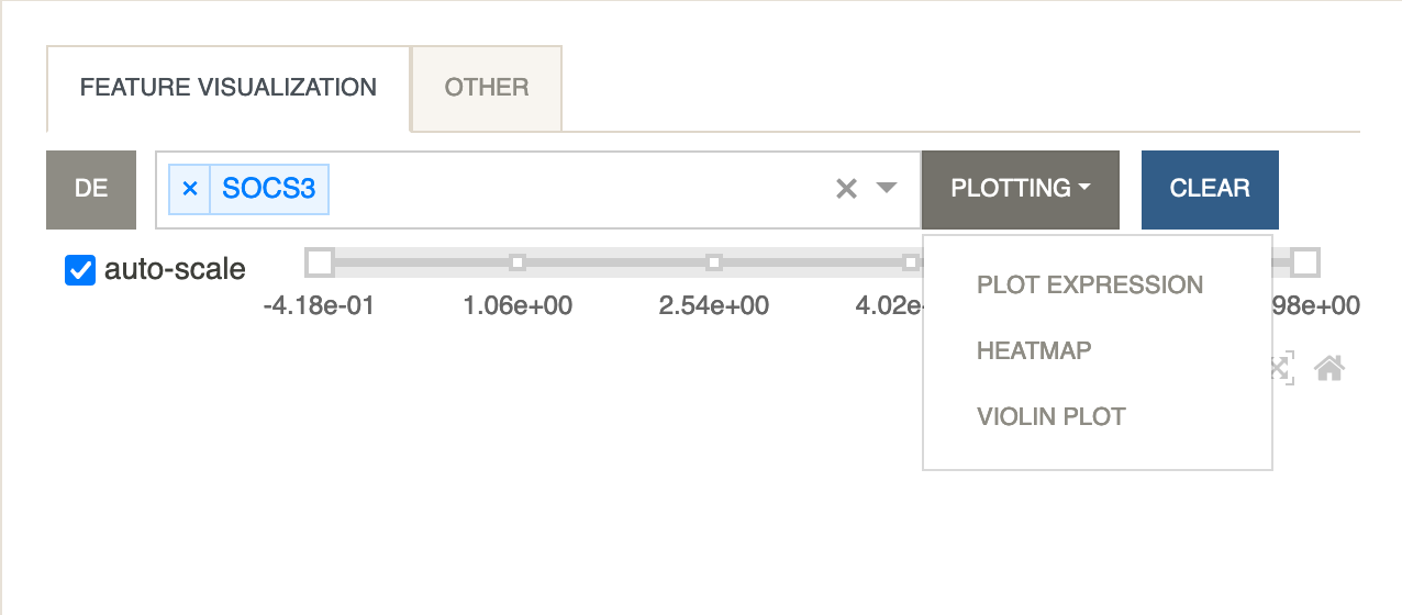
The scatter plot should update to show the expression levels of the gene as below.
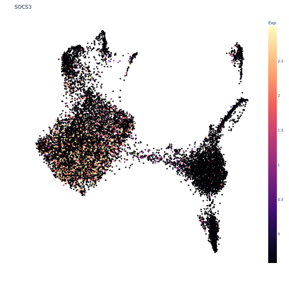
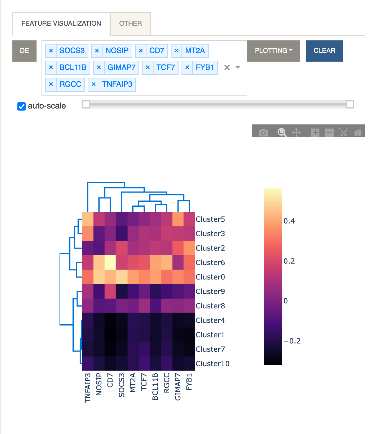
Let’s now look at a heatmap of multiple genes and their average expression levels for each cluster.
- Under
Feature VisualizationclickDE. All 10 genes from the visible page will be parsed into the input box. UnderPlottingselectHeatmap.
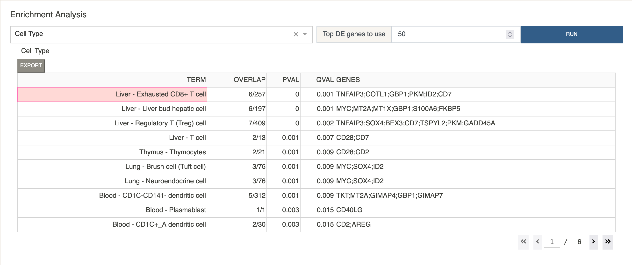
Next we take a look at some possible cell types by using a curated cell type gene set that is part of Cellar.
-
Under
Enrichment AnalysisclickRun.
This will give us a table of possible cell type assignments for Cluster 0, sorted by corrected p-value.
Let us annotate this cluster with the label “CD8+ T Cell”.
-
Under the
Annotationspanel selectCluster 0. Type “CD8+ T Cell” in the input box, and click “Store”.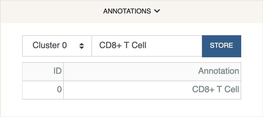
The annotation has been stored in the anndata file. We were very naive about the assignment as we only looked at the top entry returned by the analysis. In a real scenario, domain knowledge and further exploration of DE and marker genes must be considered.
Once we are happy with our cell type assignments, we can export the session file for later use.
-
Under the
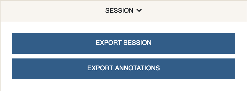
Sessionpanel click “Export Session”. This will generate an.h5adfile for download.